在 UWP 写一个界面需要将元素排列,在排列元素的时候有特殊的元素叫容器。容器的意思是元素里面包含元素,在 UWP 用到的容器有很多,也可以自己写一个。简单的容器是 Border 边框控件,如控件说的,这个容器就是用来做元素的边框。提供元素边框和背景,只能在这个容器里面放一个元素
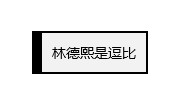
在 UWP 中可以直接在 xaml 写界面,建议将界面在 xaml 写。简单创建项目写一个 Border 里面有一个文本
        <Border HorizontalAlignment="Center" VerticalAlignment="Center">
            <TextBlock Margin="10,10,10,10" Text="林德熙是逗比" />
        </Border>
这里的 Border 有两个设置的属性 HorizontalAlignment 和 VerticalAlignment 属性,这两个属性是通用的 UIElement 的属性,也就是界面元素定义的属性
定义 HorizontalAlignment 用在外层的容器的布局,容器发现 HorizontalAlignment 就知道需要将这个元素放在水平的哪里
定义 VerticalAlignment 就是告诉外层需要将这个元素放在垂直的哪里,详细请看 win10 uwp 一张图说明水平对齐和垂直对齐
在 Border 里面只能放一个元素,上面代码是一个文本,运行代码可以看到这个界面
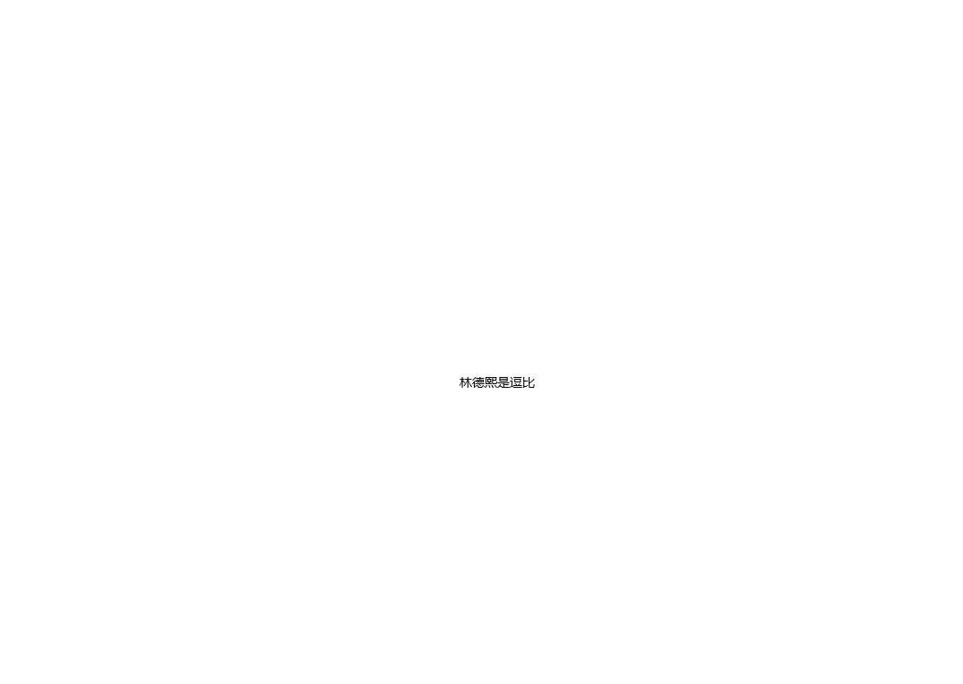
在 VisualStudio 2017 可以在 UWP 运行修改 xaml 代码修改界面,在 Border 控件定义边框
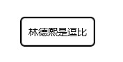
边框包括两个需要定义的属性,一个是边框的线条宽度,另一个是边框的颜色。修改代码,加上 BorderThickness="2" BorderBrush="Black" 修改 Border 边框宽度为 2 颜色是黑色
        <Border HorizontalAlignment="Center" VerticalAlignment="Center"
                BorderThickness="2" BorderBrush="Black">
            <TextBlock Margin="10,10,10,10" Text="林德熙是逗比" />
        </Border>

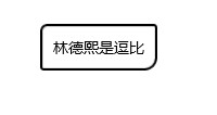
其实边框可以定制的很多,如我需要边框的上方线条宽度是 2 像素,边框左边是10像素,边框的下方是 2 像素等,我可以这样写
        <Border HorizontalAlignment="Center" VerticalAlignment="Center"
                BorderThickness="10 2 2 2" BorderBrush="Black">
            <TextBlock Margin="10,10,10,10" Text="林德熙是逗比" />
        </Border>
这里的 Border 宽度是可以使用多个值和 Margin 相同,顺序是左上右下对应修改就可以

如果修改宽度为 0 那么就看不到相同,如我就需要在文本画一条直线
        <Border HorizontalAlignment="Center" VerticalAlignment="Center"
                BorderThickness="0 2 0 0" BorderBrush="Black">
            <TextBlock Margin="10,10,10,10" Text="林德熙是逗比" />
        </Border>

边框还可以修改圆角 CornerRadius 请看代码
        <Border HorizontalAlignment="Center" VerticalAlignment="Center"
                BorderThickness="2 2 2 2" BorderBrush="Black" CornerRadius="5">
            <TextBlock Margin="10,10,10,10" Text="林德熙是逗比" />
        </Border>
和 BorderThickness 一样,可以修改 CornerRadius 的上下左右的值,顺序是左上角 右上角 右下角 左下角
        <Border HorizontalAlignment="Center" VerticalAlignment="Center"
                BorderThickness="2 2 2 2" BorderBrush="Black" CornerRadius="5 2 10 2">
            <TextBlock Margin="10,10,10,10" Text="林德熙是逗比" />
        </Border>
在 TextBlock 是没有背景属性的,那么如何给一段文字修改背景?可以使用 Border 里面放文本,通过修改背景的方法。请看代码我修改了边框的背景,这样文本也就被我修改背景
        <Border HorizontalAlignment="Center" VerticalAlignment="Center"
                BorderThickness="10 2 2 2" BorderBrush="Black" Background="#0F252525">
            <TextBlock Margin="10,10,10,10" Text="林德熙是逗比" />
        </Border>
颜色有两个写法,一个是直接写预定的颜色,如 Black 黑色,另一个是写颜色的 #AARRGGBB 可以在 QQ 截图的时候按下 ctrl 键知道屏幕鼠标的颜色
在写到了背景会看到还有属性是 BackgroundSizing 这个表示背景是否包含边框,默认的值是 InnerBorderEdge 也就是背景大小是不包括边框,可以修改为 OuterBorderEdge 背景大小包括边框。这个属性是在边框是透明的时候才有用
另外还有背景动画,这个需要在后台修改背景,通过 BrushTransition 在元素背景修改的时候做动画渐变
        <Border HorizontalAlignment="Center" VerticalAlignment="Center"
                BorderThickness="20 20 2 2" BorderBrush="Transparent" CornerRadius="5 2 10 2"
                Background="{x:Bind BorderBackground,Mode=OneWay}" BackgroundSizing="OuterBorderEdge">
            <Border.BackgroundTransition>
                <BrushTransition></BrushTransition>
            </Border.BackgroundTransition>
            <TextBlock Margin="10,10,10,10" Text="林德熙是逗比" />
        </Border>
在后台创建属性 BorderBackground 在两秒之后修改颜色,可以看到这个方法的动画很诡异,如果想要好看的动画请看UWP Background过渡动画 - 叫我蓝火火 - 博客园
        public MainPage()
        {
            this.InitializeComponent();

            Task.Delay(TimeSpan.FromSeconds(2)).ContinueWith(async _ =>
            {
                await Dispatcher.RunAsync(CoreDispatcherPriority.Normal,
                    () => { BorderBackground = new SolidColorBrush(Colors.Black); });
            });
        }

        public static readonly DependencyProperty BorderBackgroundProperty = DependencyProperty.Register(
            "BorderBackground", typeof(Brush), typeof(MainPage),
            new PropertyMetadata(new SolidColorBrush(Colors.White)));

        public Brush BorderBackground
        {
            get { return (Brush) GetValue(BorderBackgroundProperty); }
            set { SetValue(BorderBackgroundProperty, value); }
        }
Border.BackgroundTransition Property (Windows.UI.Xaml.Controls)
本文会经常更新,请阅读原文: https://blog.lindexi.com/post/win10-uwp-%E4%BD%BF%E7%94%A8-Border-%E5%B8%83%E5%B1%80.html ,以避免陈旧错误知识的误导,同时有更好的阅读体验。
如果你想持续阅读我的最新博客,请点击 RSS 订阅,推荐使用RSS Stalker订阅博客,或者收藏我的博客导航
 本作品采用
知识共享署名-非商业性使用-相同方式共享 4.0 国际许可协议
进行许可。欢迎转载、使用、重新发布,但务必保留文章署名林德熙(包含链接:
https://blog.lindexi.com
),不得用于商业目的,基于本文修改后的作品务必以相同的许可发布。如有任何疑问,请
与我联系
。
本作品采用
知识共享署名-非商业性使用-相同方式共享 4.0 国际许可协议
进行许可。欢迎转载、使用、重新发布,但务必保留文章署名林德熙(包含链接:
https://blog.lindexi.com
),不得用于商业目的,基于本文修改后的作品务必以相同的许可发布。如有任何疑问,请
与我联系
。

无盈利,不卖课,做纯粹的技术博客
以下是广告时间
推荐关注 Edi.Wang 的公众号
欢迎进入 Eleven 老师组建的 .NET 社区

以上广告全是友情推广,无盈利